

LOGO & MARKS
I have had the good fortune to work on some really unique projects! Below is a sampling of the latest…excited to be adding more to this section soon!
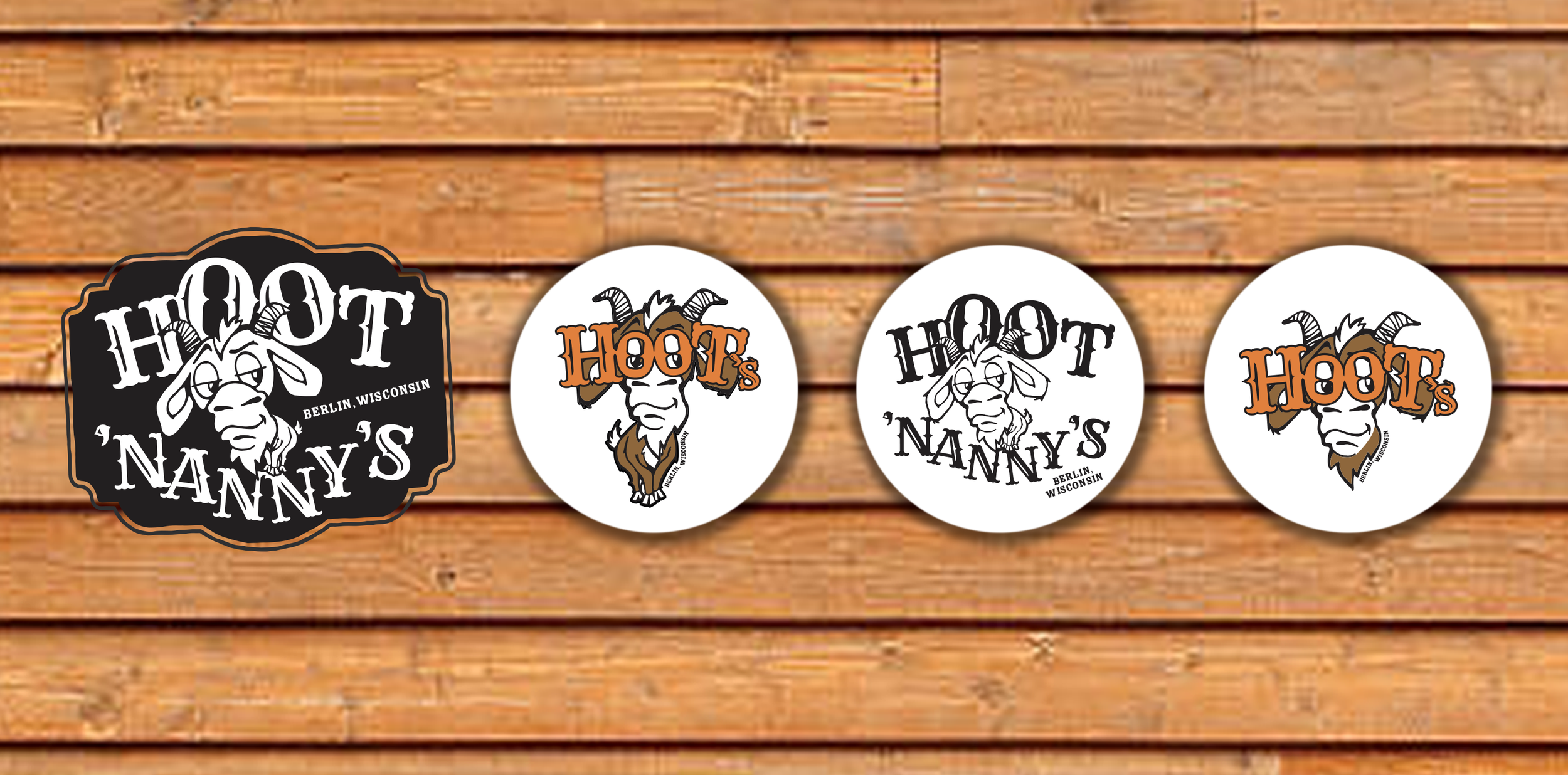
HOOT’NANNY’S
SALOON
Berlin, Wisconsin
E S T A B L I S H E D S E P T 2 0 2 1
A north-woodsy cabin-like interior is the setting for this 20-something small town bar. Special drinks & nights, young and/or celebrity bartenders, whiskeys, bourbons and loud music (all genre’s available but country seems the norm here!) make for a fun time in a small town.

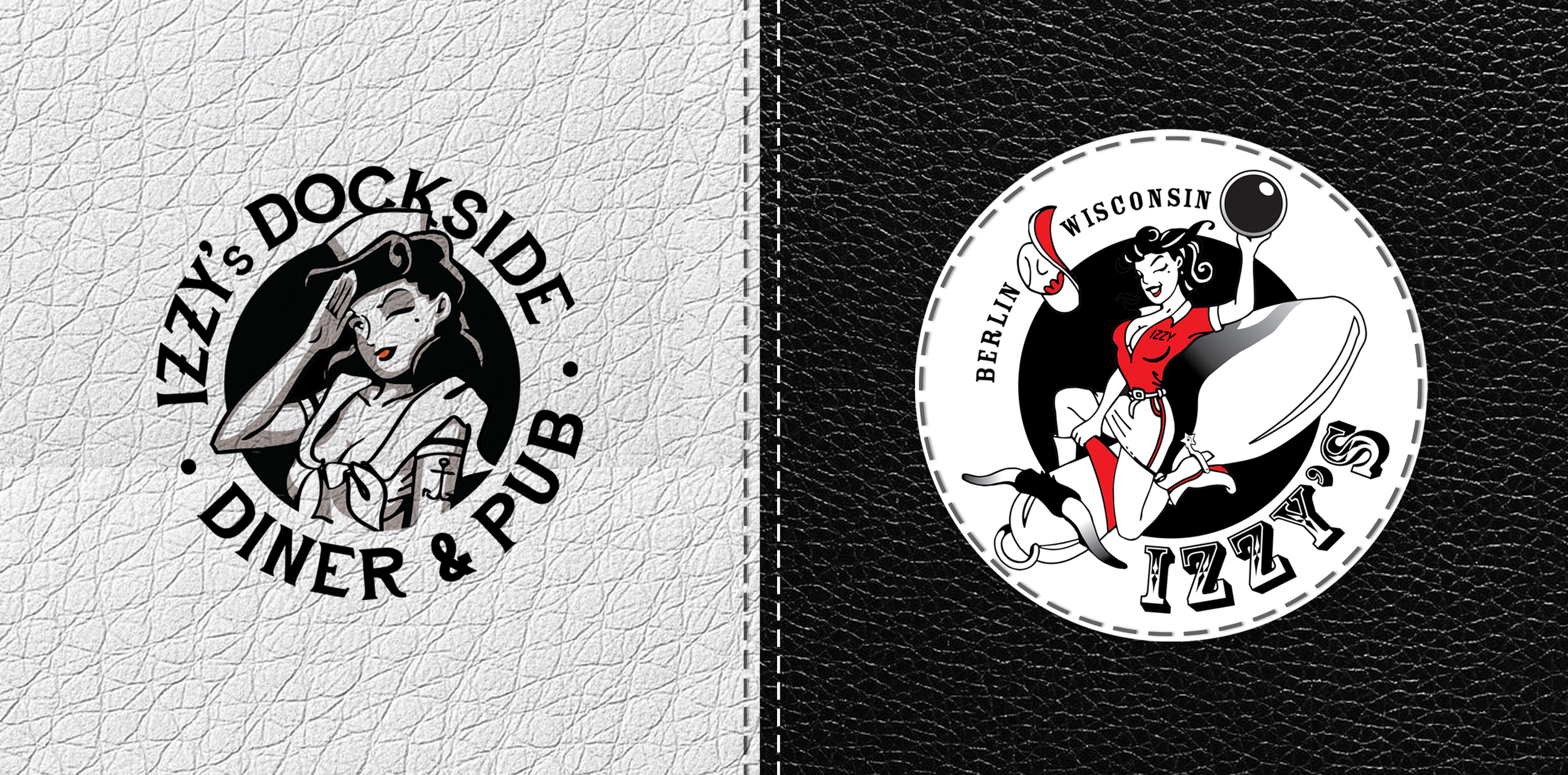
IZZY’S DOCKSIDE
DINER & PUB
Berlin, Wisconsin
E S T A B L I S H E D. J A N 2 0 1 2
Using the original Izzy art from Izzy’s Pub as our anchor for the logo, I landed on a rough serif font that reminds me of a tattoo artist. (another plus for the owners!) This font must also be readable on menus and mix well with hand written fonts and actual hand writing on the specials board.

MAD BATTER BAKERY
& CONFECTIONS
St. Charles, Illinois
E S T A B L I S H E D F A L L 2 0 2 1
The Mad Batter Bakery & Confections is a story of a baker working for a grocery store chain but wanting to do something different and more creative with the sweets. Alice in Wonderland was the inspiration brought to me by my client and I ran right down the rabbit hole!


THE HOUSE ON PARK
Berlin, Wisconsin
E S T A B L I S H E D J A N 2 0 1 5
The House on Park is a beautiful 1855 Greek Revival inspired Victorian home. It is my home and business. I strive for the home to be friendly and inviting but also creative, artistic and surprising. I love bright colors and the secondary color palette.

THE ART BAR
Berlin, Wisconsin
E S T A B L I S H E D F A L L 2 0 2 0
Missing good wines from my time in Chicago and noticing a gap in the wine and specialty cocktail offerings in town, my partners and I created The Art Bar. It is my second business in my adopted home town of Berlin, WI.
The logo is designed to feel like an upscale piano lounge.


CITY OF BERLIN
Berlin, Wisconsin
Working with the director of Parks & Recreation, we talked about updating the aquatic logo and also adding a new Parks & Recreation and a Senior Center logo to the mix. We wanted them to feel like a family with simple illustrations and fonts.

THE CAT BOX
Furniture for Cats is something I work on when I’m inspired by a new idea for my cats.
Black cats are my favorite, and they’re graphic and cool too! I put this together for myself and at some point I’m sure I’ll be famous for my Picasso Cat Climber. (see the projects section of this site!)


TUFF OWL CATTLE
My client has an affinity for owls. Tuff Owl Cattle is the name of his ranch here in Wisconsin and he was looking for an illustration/branding mark primarily to put on sweatshirts. He wanted an owl, red angus mom/baby and realism and only needed in one color A lot to put in one mark, but here it is.
We love how it looks on the hoodies!


THE UNION
The Federated Church was bought by a local businessman to be used as a nonprofit - for 2 years it was the home to quarterly antique/vintage sales and also a venue used for gatherings before being sold again to be turned into a private residence.
The logo was created at the same time as our first antique/vintage event which was focused on fashion - clothing, fabrics and jewelry. The client wanted something simple and modern to stand out in the small town,